Exhibitions
Because the real hero of Art Vinyl is the record sleeves themselves, we run a program of exhibitions that celebrate the best in sleeve design.
Kent Records
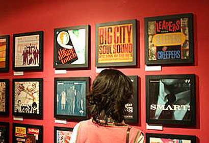
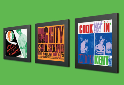
With an almost cut and paste design ethic, label manager Ady Croasdell launched Ace records with keen graphic artist Ian Clark at his side.
Here Ady remembers those days and how these now iconic Northern Soul sleeves came about as this genre is now everyone’s must have vinyl records.
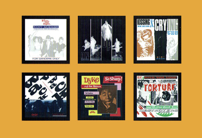
It was a bit of a surprise to be asked to compile the first Kent LP. The parent record company, Ace, had only been going a couple of years, so it really was a case of keen amateurism. Luckily, one of my DJs at the 6TS soul dances that had started three years before was a real graphic artist. His name was Ian Clark and he was a top Northern Soul DJ for many years, as well as knowing about fonts and retro styles. It was all cut and paste in those days but with scissors and glue, not a mouse! Looking back at the first cover, we got the lettering and design right but the photo was way too grey. However, the technology was limited and that was probably as good as a drunken snap could be.
What we did get right was the energy, enthusiasm and sheer fun of the photo. Those people were obviously having a hoot (and were actually stylishly dressed for the time) and the music on the album could do that for you too; honest guv. The other master stroke was my partner Randy’s brother Gil getting his black taxi driver to hang about for a few minutes and then dragging him onto the dancefloor. It might have been the only dance he had in his life but it got the multi-cultural soul image across to wannabe soul people.
The runaway success of the first LP (it was as iconic to mod school-kids and apprentices as Geno’s “Hand Clapping, Foot Stomping, funky Butt. Live” had been for my late 60s mod generation) meant that we had a bit more time, experience and know -how for the second album; and it showed. ian’s artwork improved over years and his quirky “extras” that he threw onto his ^TS dance flyers, like dominatrixes, middle class 40s squares and random explosions, gave our covers a distinct style.
Pressure of work and sheer numbers meant that established sleeve designers were eventually given some of the projects to take the load off Ian and we went back for more of the ones who nailed it.